
Good morning, money nerds!
Today I thought we could play a little game called “How do your finances compare to the average American’s?”
Below I’ve gathered 10 money statistics about the average U.S. household’s finances. And while this data has no actual effect on your personal situation or trajectory, it’s still fun to see how you stack up.
I’ve also showed my own comps. Feel free to play along and drop any fun results in the comment section. Remember, it’s just a game. Don’t get too wrapped up in the numbers — everyone’s situation is different!
Let’s get to it …
The Average American Financial Profile: How Do You Compare?
Most of this data is pretty recent, but because 2020 was such a strange year, some data points are a few years old. There are also a ton of variables that we could pick apart in this data, but for now let’s just play along and take the figures at face value.
1. The average gross household income is $87,864
Well, I’m not off to a great start… My wife and I are already below average in this category. Our household income for 2021 will probably be between $70 – $75k, not including investment growth or rental income. Oh well, we’re committed to Coast FI so our income is intentionally low!
Interestingly, we do earn more than the median income in this study, which is ~$62k. You can check out all the study data here with categories and breakdowns: Average U.S. Income)
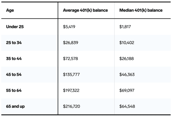
2. The average balance in a 401(k) is $106,478
Woohoo! I’m certainly above average in this category. Just checked my IRA balance (Don’t have a 401(k) from my employer any more) and it’s sitting at $175,684.
This statistic comes from Vanguard’s 2020 How America Saves Report. Here’s also a screenshot of the average and median by age breakdown…
3. The average American *retirement savings* is $407,490
I like this study a bit better than the last. It’s from Personal Capital, which as you guys know has a more complete overview of people’s entire net worth — not just their 401(k) balances. This data is as of April 3, so it’s hot off the press!
The study also breaks down average retirement savings by state, as well as age groups which are pasted below.
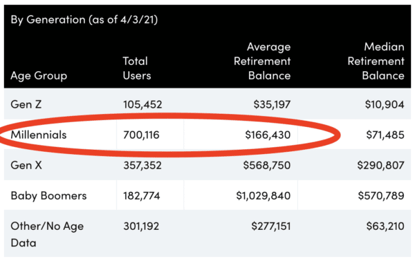
For my wife and I, we rank above average in this category for our state, age group, and the general averages. We are on track to early retirement!
4. The average checking account balance is $10,618
As of this writing, my wife and I have a little over $24,000 across our checking accounts. So we’ll claim above average for this statistic.
In the full report here, it also shows that the median checking account balance is only $2,000. Which means 50% of Americans have less than $2k in their checking accounts.
5. The average American spends $5,102 per month
Here’s a peek inside the average monthly expenses of Americans. The total is a little more than $61,000 each year. Keep in mind this is the average, and there’s a pretty huge difference between high/low cost of living areas, kids or no kids, etc.
As frugal as my wife and I are, living in LA puts us in the above average expenses group. At least for this year and next! Most of our income will go to rent and travel.
6. The average FICO credit score is 711
Some good news… The data shows that the national average credit score has increased every year over the past decade! If you want to see how you compare by the state you live in, all the data is here.
I regularly check my credit score with the Mint app. Right now I’m sitting on an 814, well above average.
7. The average American has $6,194 in credit card debt
I feel like this statistic can be interpreted many ways. In fact, the full report shows that most people (52%) have a balance of less than $2,500.
For my wife and I, we keep a rolling credit card debt of about $2-3k, and our accounts are paid off in full every month. I’m gonna give us a below average rating on this credit card debt category.
8. The average U.S. *total household* debt is $145,000
This total household debt statistic covers a broad range of debts like auto loans, home mortgages, rental property loans, student loans, etc. So I guess the argument of “good debt” vs. “bad debt” is open to interpretation here.
Since my wife and I currently have 9 real estate investments, all of which are leveraged with mortgages and loans, it’s safe to say we have above average household debt compared with others. Except mortgages, we have no other loans or consumer debt. :)
9. The average U.S. savings rate is 13.7%
This is a 2020 statistic, which could be an anomaly because a bunch of households cut down their spending last year in quarantine. The 2019 savings rate was just 7.6%. See all yearly data here.
My wife and I are definitely below average in this category. But, as I mentioned before, we are coasting to early retirement as our existing assets are compounding quicker than we can save excess money ourselves.
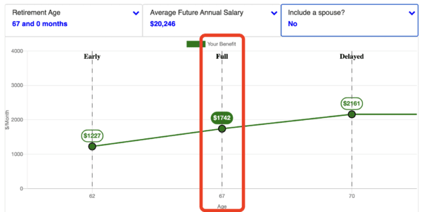
10. The average Social Security retirement benefit is $1,514 per month
Social Security benefits are very modest. For a medium earner retiring at age 65, it’s predicted that Social Security income will replace only about 35% of their prior working income. Daaaang! A good reminder to take retirement into your own hands and build up your personal nest egg.
Personally, I don’t include Social Security income in my retirement projections. I’m still 30+ years away from any benefits, and a lot can change in 30 years. I just logged into my Social Security portal and it shows I’m on track for a $1,742 monthly payment. So I’ll put myself as above average for this data point, even though it’s kind of moot for me right now.
So there you have it!
How do your finances stack up? Do you feel OK with your situation compared with to your fellow Americans? (Sorry to the international readers out there!)
My results are all over the place, in both good and bad ways. I have low income, high spending, larger than normal investments, a weird debt profile, etc. In general I feel good, but there are definitely some items I can improve on.
What about you?
Oh, lastly, a quick note about comparisons… Usually I don’t recommend comparing yourself to others — it can lead to unhappiness. So, keep the following in mind when you play games like this:
- This is just a game. Average stats don’t determine your personal success.
- If you are above average in something, take a second to count your blessings and practice appreciation.
- If you are below average in something, use it as motivation to progress and get better. That’s what this blog is all about — helping improve your situation (and having fun along the way). Let me know if you need help in any specific area.
Have a great week,
– Joel
Get blog posts automatically emailed to you!


Happy Monday Joel!
Loved reading these statistics, it’s refreshing to see these averages and be able to compare your own progress against the rest of America.
Hopefully you have an awesome week!
Cheers,
Fiona
Glad you liked em Fiona. Have a great week dude!
Hi Joel, some interesting stats!
Just wondering: Why didn’t you include rental income in your household income? Wouldn’t that be included when the statistics were collected? I think you may be making yourself “below average” for no reason there.
Also just wanted to point out:
In some of these cases it’s actually GOOD to be below average (e.g. debt level). Maybe phrasing it as “better / worse” than average would make it more clear.
I followed some of the source links through as well, interesting to see how much this does vary by state. Median income for men between $36,010 (New Mexico) and $71,190 (DC), that’s nearly double. The gender pay gap also varies a lot across states. I imagine across countries it will vary even more. I could probably spend hours digging through this data haha.
Hey Lady! Great points! I didn’t even think about rental income but you’re probably right – if other people include it in the statistic data then I should include it too. In this case I’m definitely crushing the average there! :)
I originally had it color-coded (green for good, red for bad). I guess everyone can make up their own mind about how they feel about some things whether it’s good or bad… For example: total houshold debt, I consider a huge debt number as a good thing (home mortgage, leveraged real estate), whereas some people might say it’s bad in their situation.
I know what you mean about the averages being hugely different across the US. There are way too many factors, so all stats should be taken very lightly. Don’t get too lost in the data. It’s interesting, but also mostly useless as far as building your personal tactical wealth plan. :)
Why don’t you include rental income in your income? Seems like you would at least include the difference between the mortgage and the rental payment.
Good catch, Mary! I just found this in the data report: “Editor’s note: we aren’t reporting the median and average *salary* in the U.S. here — instead, we’re reporting *income*. The U.S. Census Bureau tracks earnings (which are made up mostly of salary and wages) and income, which includes all sources of money that people bring in.
So yes, I should have included rental income. Woohoo we’re crushing this category :)
Statistic #3 from Personal Capital could maybe use a disclaimer. If it’s compiled solely from their users, that’s a very self-selecting financially aware group. We don’t use Personal Capital but it’s nice to be able to compare our statistics with similar-minded folks.
As a household we’re doing great compared to both their state and generational figures; as individuals, somewhat less so. It’s nice to have that gut check when we start to get too satisfied with our balances!
Adam, I had the same thought, especially for the Baby Boomers category. I know a lot of boomers and think the average/median is skewed much higher from a more ‘self-selecting financially aware group’ that would even know a Personal Capital exists. Many boomers I know get much of their income from defined benefit pensions and SS which wouldn’t show up in these balances.
Hey Adam! Not sure if you’ve seen this…. It’s a survey done completely with FIRE people as respondents… It’s skewed towards Australians, but i’m hoping someone in the USA will make a FIRE survey dashboard like this one day. It’s fun to know what other FIRE community members are doing.
https://www.aussiefirebug.com/australia-fire-survey-results-2020/. (at the very bottom there’s a link to “fullscreen mode” of the dashboard where you can interact and drill down into the data!)
Again, I should point out that comparing yourself to others is a slippery slope! It can be helpful sometimes and humbling, but it can be harmful in some ways because FIRE IS NOT A RACE.
Wow, reading about these “averages” makes me wonder if those articles saying “40% of americans can’t afford a $1,000 payment” are actually true. I had no idea the average income hit $87,000 that’s really good.
The average debt balance isn’t all that bad either especially when it includes mortgages. This is making me scared and that I should be trying harder.
Well, remember that “averages” are thrown off by extremely wealthy people. “Median” is a better measure if you’re talking about a % of the population. Also there’s a huge difference state by state and city by city. My guess is you’re doing just fine David :)
Definitely agree on this. Looking at the median is much more useful to understand the “typical” situation.
I’m delighted that despite my idiocy (and my husband’s, bless him), we are a teeny tiny bit ahead than our peers … by a few dollars actually.
We are all effed if we don’t get our acts together!!
Even though we shouldn’t, it’s still fun to compare ourselves to our peers. Gives me motivation to up my game if I’m slacking or the confirmation I need to see what I’m currently doing is working. I wonder if there are stats that get rid of the top 1% as I would agree that those figures likely paint a rosier picture than what actually exists out there.
Sometimes the study groups release their original raw data results so people can filter them. I agree, it’d be really interesting to see numbers when the outliers are removed. My guess is even removing the top 0.01% would make a big difference in some of these stats.
This is an amazingly detailed and long article, Great blog you got going.